In many modern manufacturing improvement systems the Machine Cycle Chart is a key ingredient in helping the operation understand how equipment works. The idea is this: every machine or process runs in some sort of cycle. In some equipment this is fairly straightforward, as you can see a series of steps that a machine goes through to perform its function. Others take a little more inference to decipher, and a few take some creativity to illustrate. My observation is that most people are first asked to make a Machine Cycle Chart, their efforts are very superficial. They capture the big things that happen and then put a checkmark on the list that they have completed the task and move on to the next task in the improvement process. Most people I’ve worked with don’t see much value in the Machine Cycle Chart, because they don’t dig in deep enough. It is one thing to see things happening, but quite another to be able to explain why they happen. The “why” is what makes the Machine Cycle Chart powerful.
In continuous processes where a product is transformed by flowing in some way through a processing mechanism, it sometimes is hard to discern a machine cycle. I’ve found two ways to view the cycle to consider that can be of help. The first way is to look at process as it controlled overall, the start-up, the transition to steady state, steady state operation, process upsets and recovery, and process shutdowns. Illustrating these can help explain how well the system is designed to respond to abnormalities and the ways it tries to remain stable. The second way to think of a machine cycle is to consider the process through the vantage point of the product being processed as it goes through each transformation. Some projects I’ve worked have developed Process Transformation Diagrams that illustrate what is required for the product to be produced at acceptable quality. Often there can be important equipment conditions that must also be considered for the process to be maintained that you should add for your Machine Cycle Chart.
In equipment that makes discrete products, the machine cycle generally follows one of two principles, either event-based intermittent motion, or continuous 360 degree rotating motion. Some machines are a combination of the two, which make it even more interesting. Add to this that much of what happens in a machine is the result of electrical sensing inputs, mechanical motion, and potentially pneumatic or product flows, you start to see that things may be more complex than you first think. And finally, recognize that some things work on a delayed basis- when an electrical system tells something to move, it takes time for motion to begin and for the motion to be completed. So the idea that you just observe what happens, draw it out, and you now understand is a little naïve. A basic cycle chart is not bad and shouldn’t be discounted completely as I’ve seen many problems solved by people who needed to put just a little observation into a process to understand it and improve it. However, once the low-hanging fruit has been picked and problems still remain, I’m often asked to help dig deeper.
So what should a Machine Cycle Chart look like? For most situations, the engineer in me likes to make a timing chart style diagram. I find it to be precise and a good way to illustrate relationships between various parts of the equipment that interact with each other and with the product. While I find this the most helpful, I’ve seen that many operators have a difficult time comprehending a diagram like this and prefer a simplified block diagram. However, if detailed interactions are lost in simplification, I think the whole point of the diagram is lost. So if the issue is explaining interactions, the next form I use is to draw a cartoon picture of the process in Powerpoint and make it move through the various points of the cycle, but that’s another discussion completely.
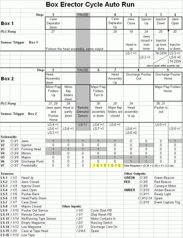
Let’s look at an example of a box erector. This particular machine separates a blank from a magazine and opens it, while a second box is being folded and discharged. There are nine steps in total. The first chart I saw drawn for this machine showed nine blocks linked together. In looking at the PLC program, it isn’t clear that one box starts being erected before its predecessor is finished. But once you see the steps and watch the machine, you realize that the machine has to pay attention to both boxes and their interactions to get the most out of the equipment. In addition, this machine has the ability to “pause” during the cycle when the discharge of the erector is blocked by boxes. It is important to note when this happens in the cycle- the most stable condition of the process where both boxes are fully under control.
This machine is event-driven. Each step starts when a sensor detects that the previous step is completed. A cheaper alternative would be to assume that a motion occurs after an output is turned on or off, based on time. Spending a little extra to verify that each step is completed brings several benefits. First, you take as long as it takes for a movement to occur and no more. Second, as components wear or material varies the time can slow but still make good quality. Third, if a jam occurs and the motion isn’t completed in a timely fashion, the equipment can be stopped before any more damage to the product or the equipment occurs. In addition, a nice side benefit is that you time each step of the cycle, as described in my article on Trap Timers.
I originally made this chart into a spreadsheet well over 10 years ago. I was interested in making the machine run more consistently with less stops, yet have a higher cycle rate. Over time I added details- the inputs that are sensed at each step, the condition of each solenoid valve at each step, a total listing of all inputs and outputs. The machine is simple enough that this chart can tell someone looking at it almost everything about how the PLC program functions, even if the person looking at the diagram knows almost nothing about electrical systems. For the programmer or troubleshooter, every device on the machine is accounted for with the basic uses of it for logic. You could write a PLC program for the normal cycle using just this diagram.
I’ve also used this machine cycle chart to study the cycle and improve it. When the erector came from the factory, step 4 didn’t occur until after step 9 was complete. It wasn’t obvious at first, but as we watched the machine, we realized that we could open the first box as soon as the second box was out of the way and didn’t have to wait until the pusher returned home that pushed the second box out. We changed step 3 to exclude the pusher being home as part of its completion. After checking all the various inputs and outputs, we were able to change the program to start step 4 right after the revised step 3 was complete. This saved about a half second on a four second cycle, over a 10% improvement in throughput without speeding up any motion.
The erector example is relatively simple in that all motion occurs by air cylinders and verified with sensors. The next example is from a coffee espresso pod maker. In this machine, one piece of paper is formed into a mould and then filled with a dose of coffee that pressed in tightly. A top sheet of paper seals in the coffee and the pod is cut out from the web and transferred to a packaging station.
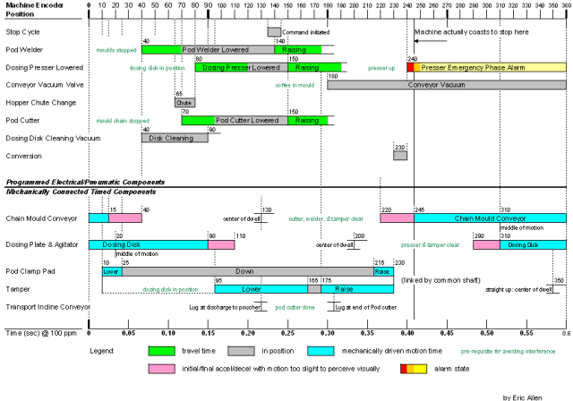
This machine is a combination of continuous mechanical motion from a drive shaft and a number of discrete intermittent motions driven from position settings linked to an encoder on the drive shaft. The first Machine Cycle Chart was done by a controls contractor who draw out the pneumatic part of the chart, based on when things were turned on and off. The operation was experiencing a number of “crashes” or incidents where the machine bound up mechanically, sometimes damaging parts of the machine. The machine’s 360 degree cycle is about 1 second, so everything moves faster than you can see. One of my co-workers tried to use high speed video to capture more detail to understand what was happening, but he couldn’t position the camera and light it in a way that provided images that were helpful.
Additionally, one of the mechanical motions, the chain that held the moulds, was made intermittent by an oscillating gearbox that had internal cams to pause motion for part of the cycle and move in others. All the mechanical motions of the machine could be adjusted in relation to the others by loosening and moving the connecting parts of the drive system.
I decided that we needed to better understand all the mechanical motions and also determine how they were related to the postion settings from the encoder. I downloaded a spec sheet from the gearbox vendor to get a good understanding of the motion profile as well as to understand how the input and output shafts were designed to start from a home position. Using each mechanical connection, the gearbox motion profile and the output of the encoder, I was able to determine exactly how many degrees each action took place in relation to the others and then put it together with the position settings from the encoder. I added buffers for motion that took time to happen from when the encoder signal was given until the motion was complete. When I put it all together, I was able to see places in the cycle that were high risk for problems. With the research I had done, I was able to adjust the mechanical interactions to avoid conflicts and then change position settings to the safest spot in the cycle for best quality performance.
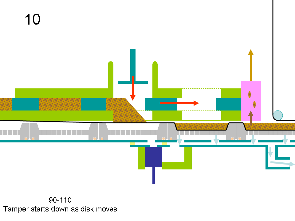
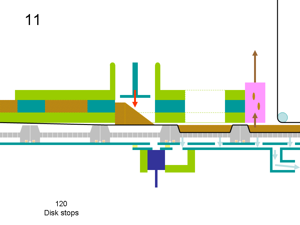
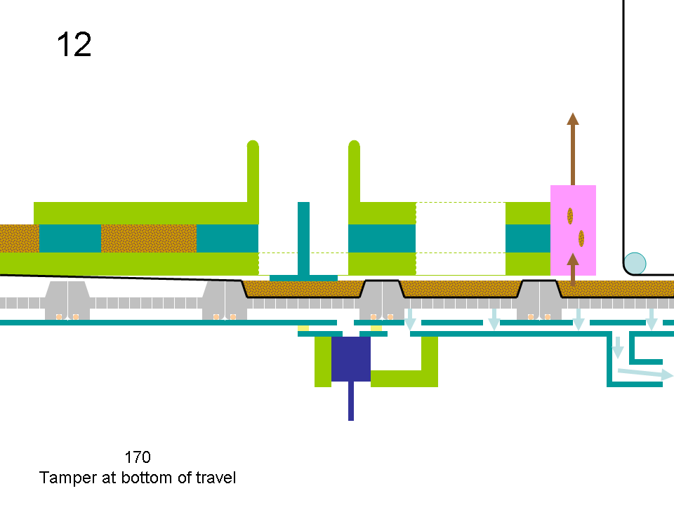
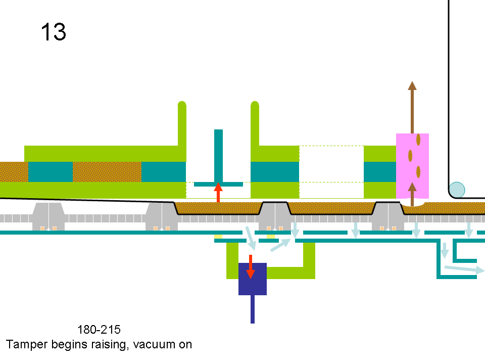
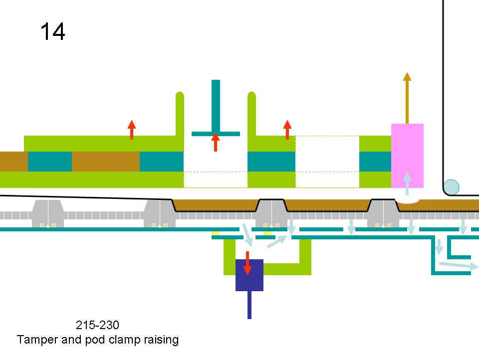
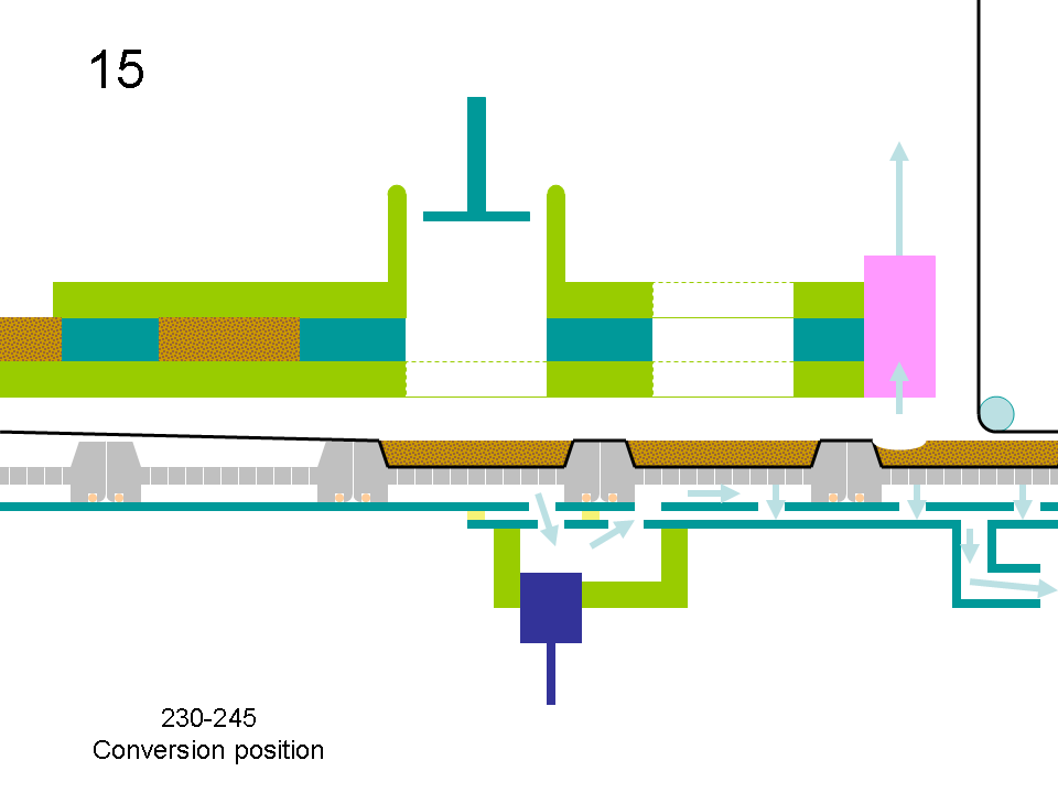
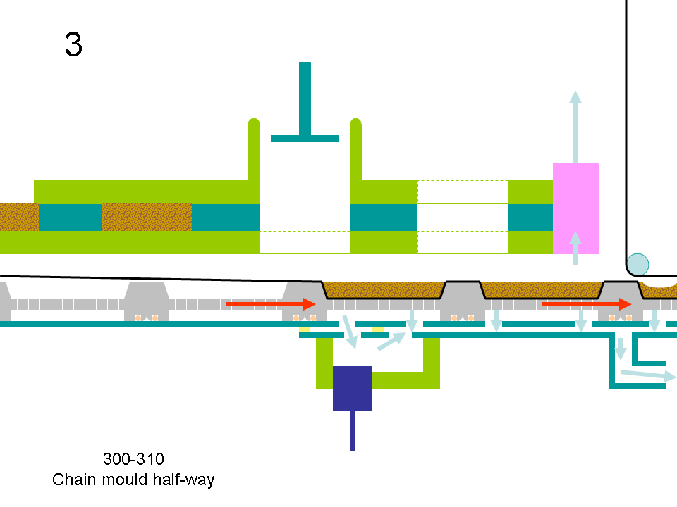
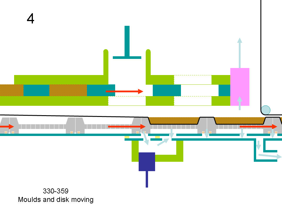
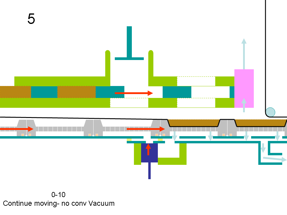
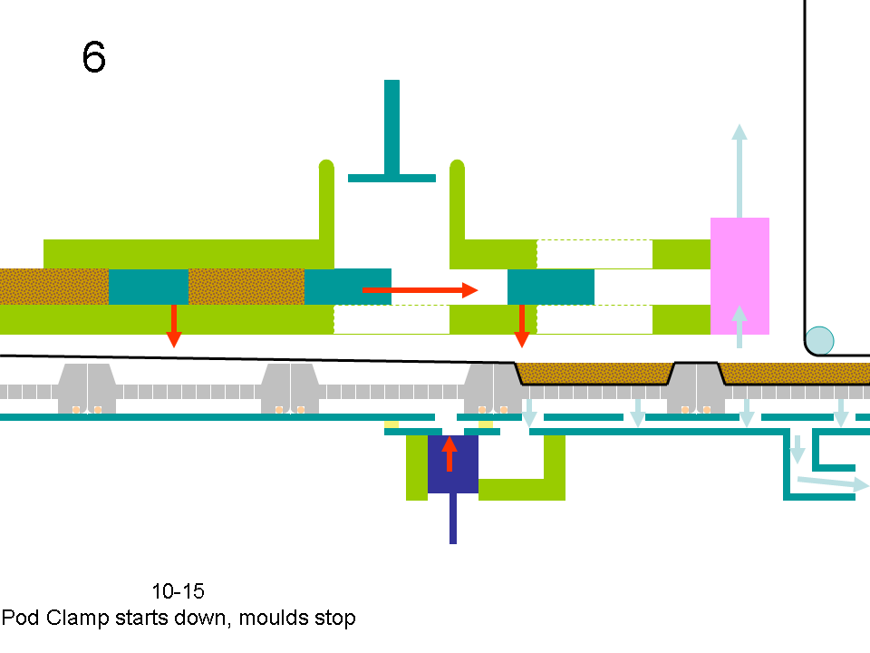
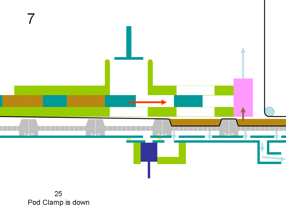
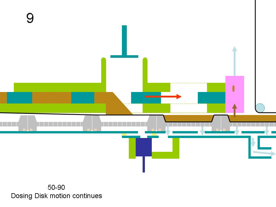
I re-drew the Machine Cycle Chart and explained it to the operators, so they could see the impact of any changes they made. I also made a series of lessons on how to mechanically set each component in relation to the drive shaft and to each other, taking pictures to explain items that were hard to comprehend. Finally, I decided that the best way to teach people about how the machine operated was to make a Powerpoint movie of key points in the motion, as a moving picture is much easier to understand than a cycle chart. With the Powerpoint presentation, I was able to show operators exactly what the concepts were with the machine and relate it back to the Machine Cycle Chart. Then operators could understand the importance of inspections and proper set-up of each component whenever there was a question. The number of problems on the line decreased substantially and major machine breakdowns from improper adjustment were virtually eliminated. We even made progress on eliminated a source of contamination. But, I’ll leave that discussion for a future article on Using a Powerpoint Movie to Explain the Machine Cylcle.
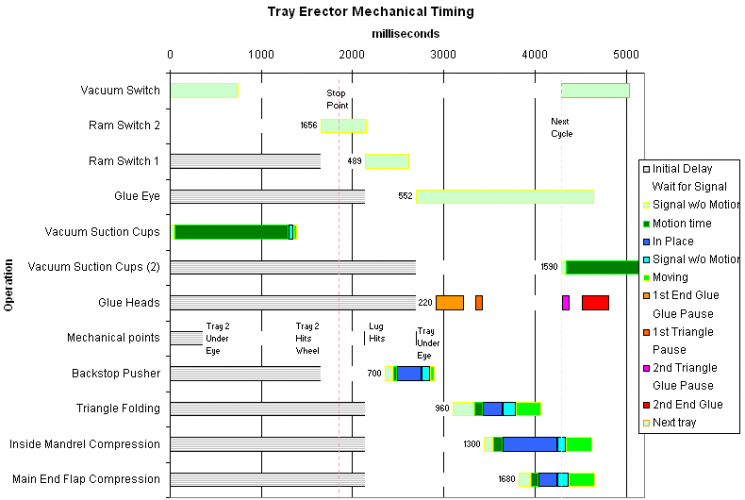
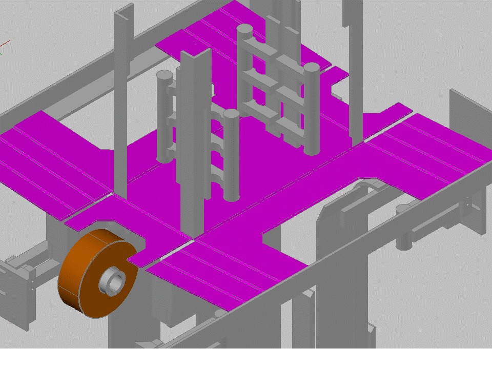
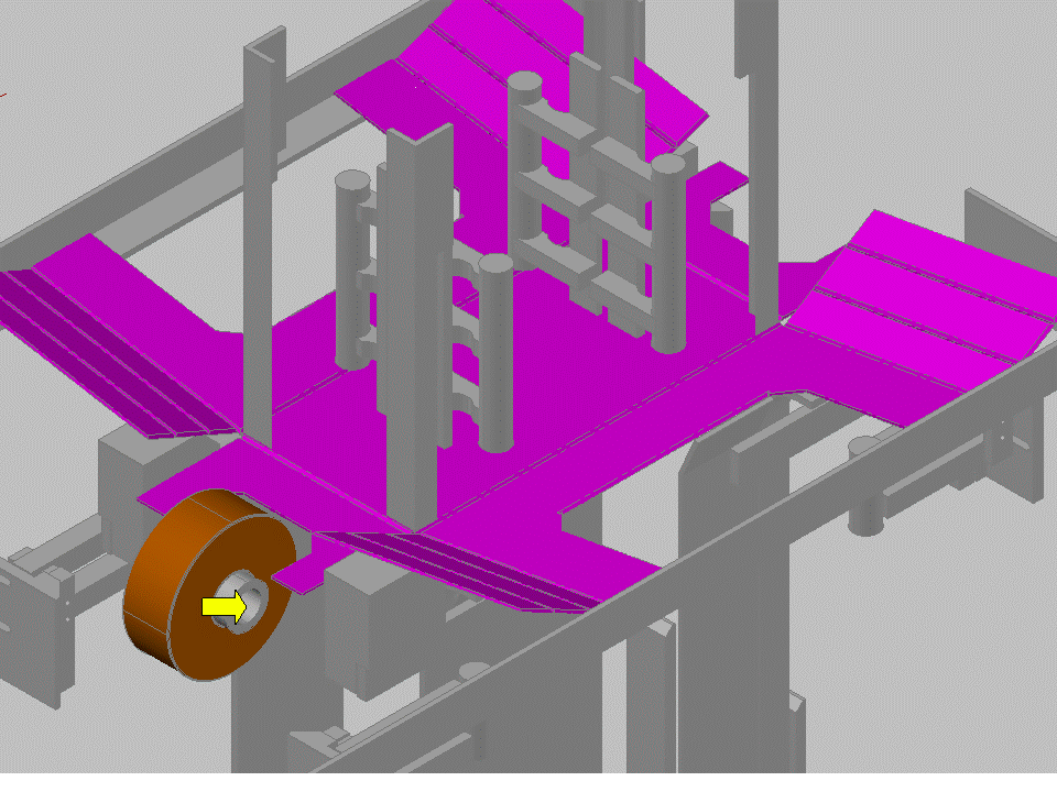
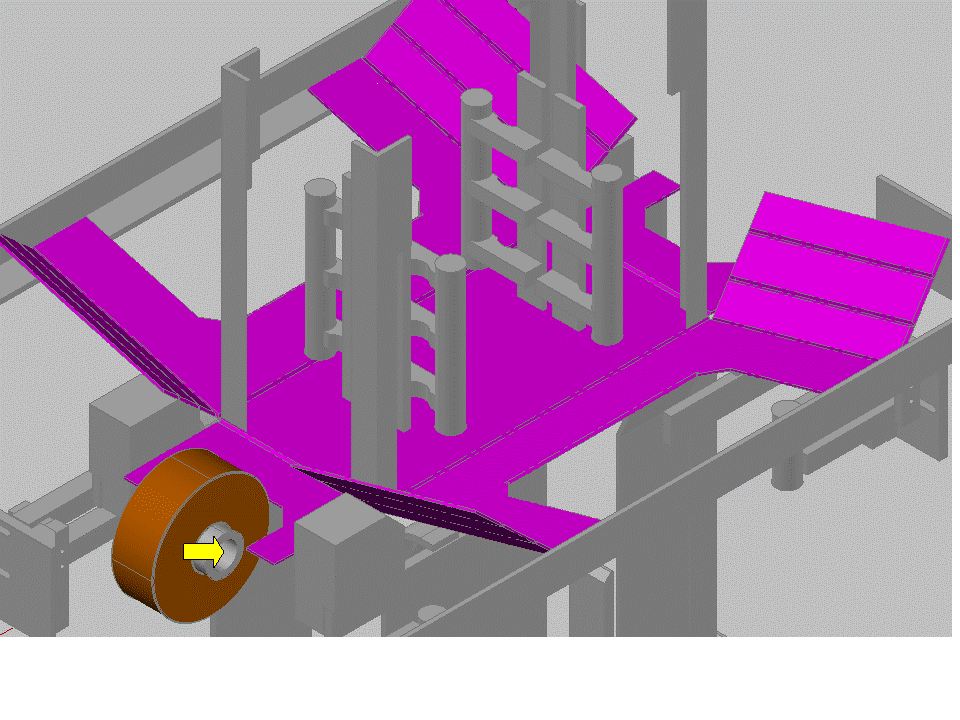
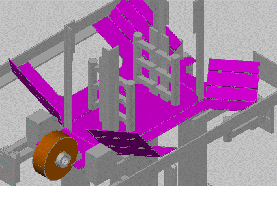
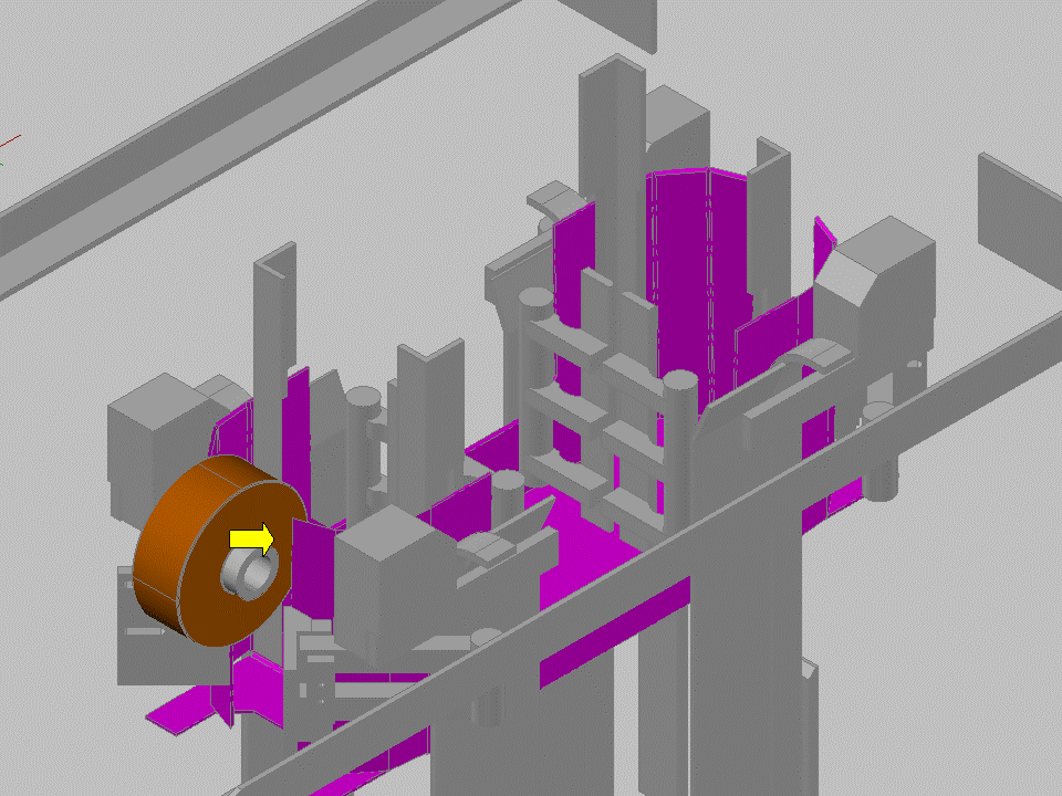
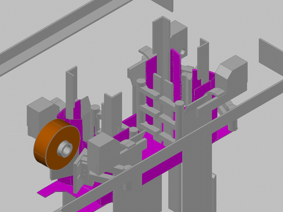
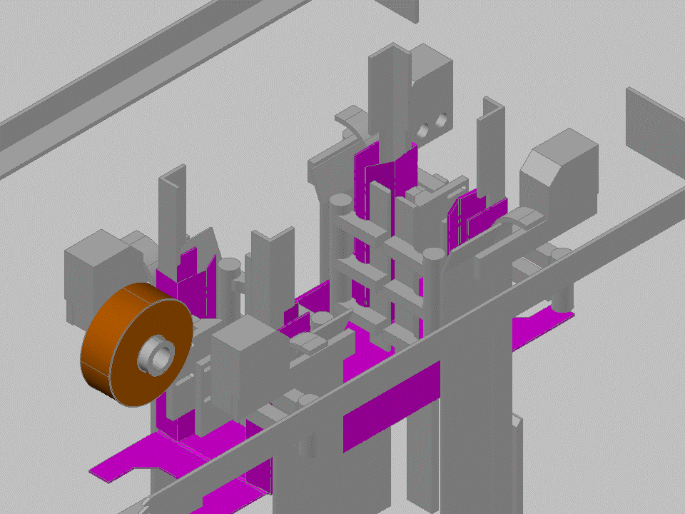
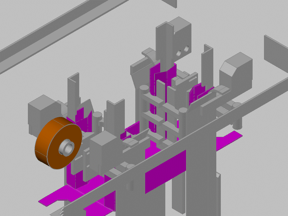
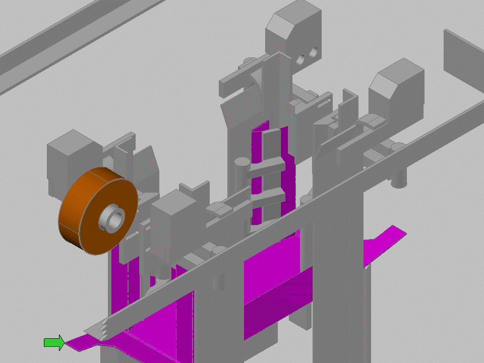
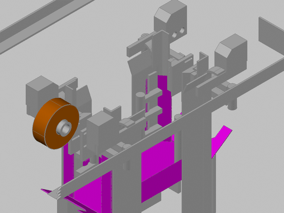
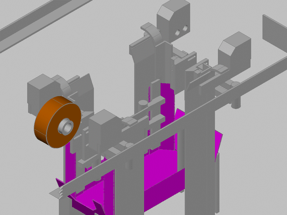
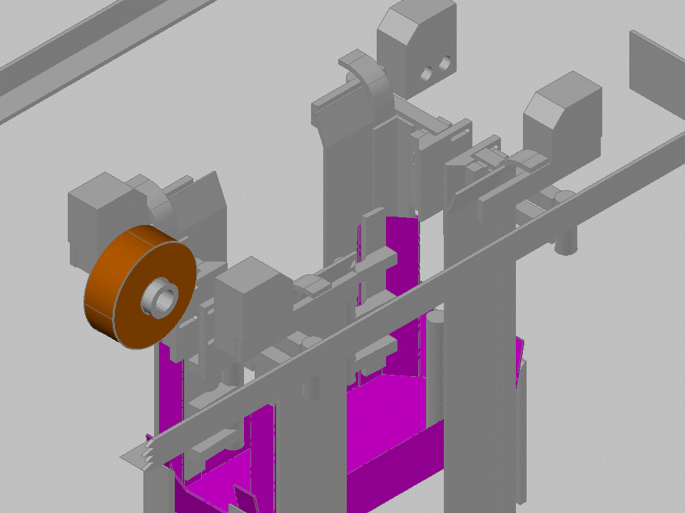
My final example of a Machine Cycle Chart is from a tray erector that was giving us some problems after it was purchased and installed. This tray erector made trays with triangular corner posts for bearing heavy loads. To make these corner posts, a number of folds were required with glued joints. The machine put out a tray every 4 seconds and all of the folding and compression occurred in a period of about one second, with so many motions so fast that you could watch for an hour and not catch exactly what was going on.
Similar to the first example, more than one tray could be being made at one time. In fact, depending on the circumstances, one, two, or three trays could be in process at any given time. As I studied the cycle, I realized that each tray required some air flow, and that the trays being made at the same time could alter air pressure at the line and cause the machine to perform differently when trays were back to back compared to a single tray. In fact, as I timed out all the motions, I found that glue heads for tray 2 were operating at essentially the same time as air operated folders were moving to fold tray 3. Both used compressed air. Air pressure noticeably dropped when two trays were in these positions, compared to times when only one was in one of these spots. As it happened, the machine was running twice as fast as the line required, so I was able to change the logic, so that the machine picked a tray to glue and fold every other cycle, which made the machine run much more consistently.
Similar to the second example, this machine was a combination of a continuously running drive shaft and several intermittent pneumatic folders that are driven off of timers triggered as mechanical parts pass proximity switches. The main actions of the machine are a long horizontal drag chain that pushes flat blanks under glue heads at a constant speed to allow a pattern to be put on the card board from 10 different glue nozzles. The box is then positioned under a horizontal ram which drives the blank down through a series of passive and active folders. As I tried to optimize the cycle, I realized that the relationship between the mechanically driven parts and the pneumatically driven components were not as simple as they appear.
Since cycle time is short, short delays in motion are critical to understand. Using high speed video, I was able to determine exactly how long it took for the pneumatic cylinders to fold. However, it took more effort to see how long the delay was from when a solenoid valve was turned on electrically until motion began. It takes time for a solenoid valve to slide from one position to another and for air to enter one line and exhaust from another. Movement can’t begin until the pressure is greater in the side of the cylinder that needs to be pushed than on the side being exhausted by a difference enough to overcome friction in the cylinder and the mechanical components attached to the cylinder. Normally, in most applications this time is insignificant. But on this machine, some of the cylinders had several feet of tubing between them and the solenoid valve controlling them. This tubing had to be filled with air and then drained each cycle, which takes time. I considered trying to model the pressure changes over time, but I decided that there were too many diameter changes in the system that would act as flow restricting orifices to effectively calculate how much air would flow through the system at any point in time using calculus and the laws of physics. Instead, I decided to use more observation through high speed video.
Before going further, I should point out that this machine did not have sensors to detect when a motion was complete, so unlike the tray erector example, I couldn’t just trap times. Installing sensors was cost prohibitive for this machine, and some places didn’t lend themselves to getting sensors in a position that would be effective. As a result, this machine was not totally event driven, but was driven based on the assumption that needed motions were taking place.
To determine the delays involved, I noted the position in videos of the tray being rammed through the forming section in comparison to the motions I observed. I then modeled the motion of the tray based on a sinusoidal motion profile that occurred from the rotary motion of the drive to the ram mandrel. I was able to calculate where the tray was in relation to the timers that were turning on the pneumatic solenoids. I found that two of the folders had delays of around 0.2 seconds before motion began, an amount approximately the same as it took to move the cylinder. I have illustrated this in the Machine Cycle Chart and on the settings page of the operator interface.
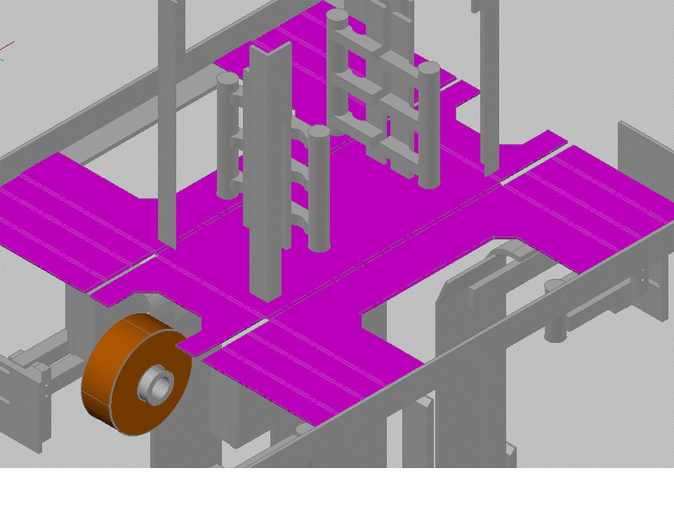
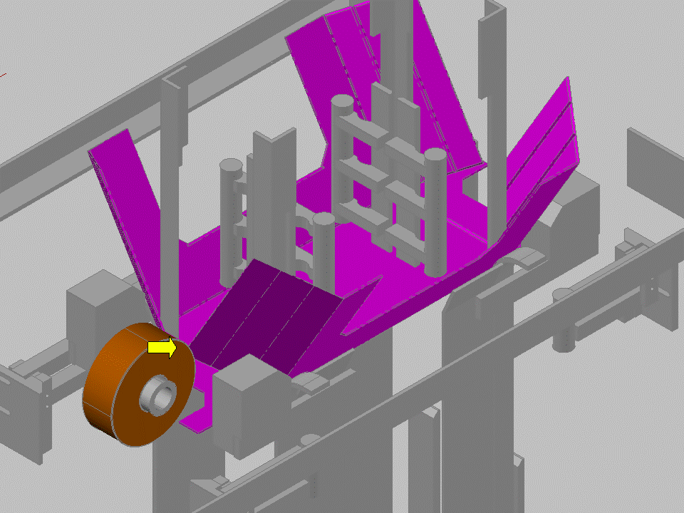
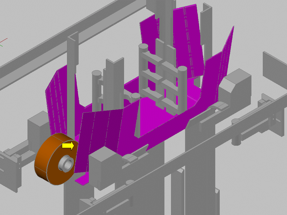
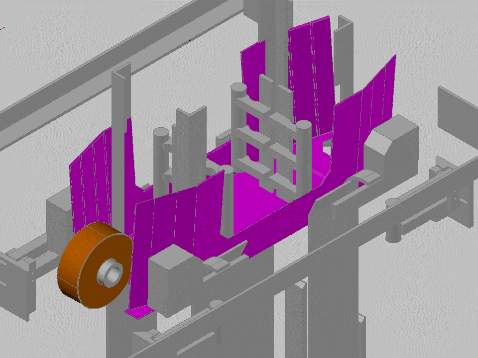
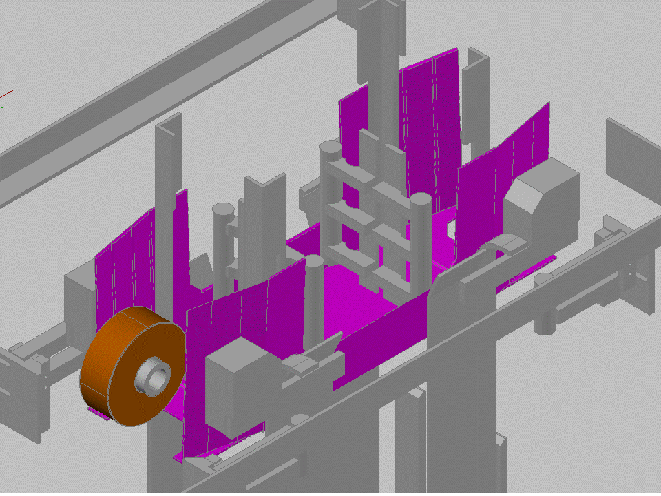
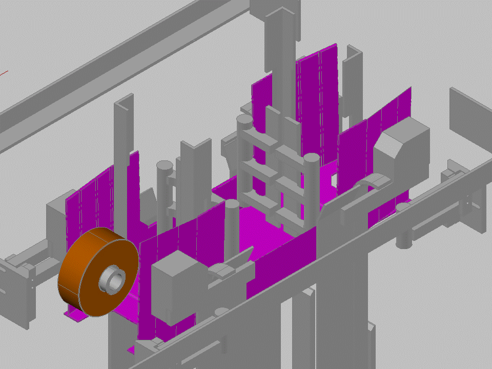
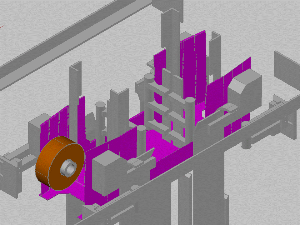
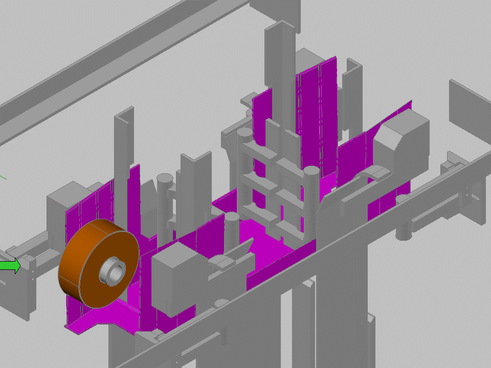
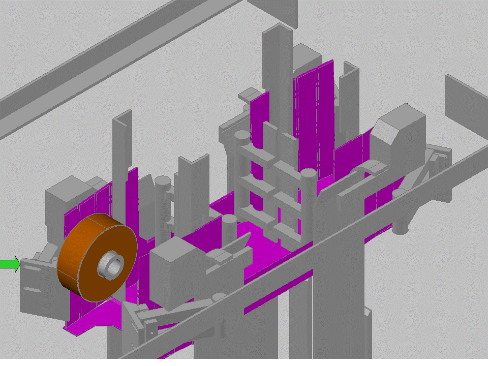
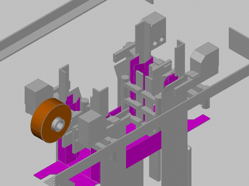
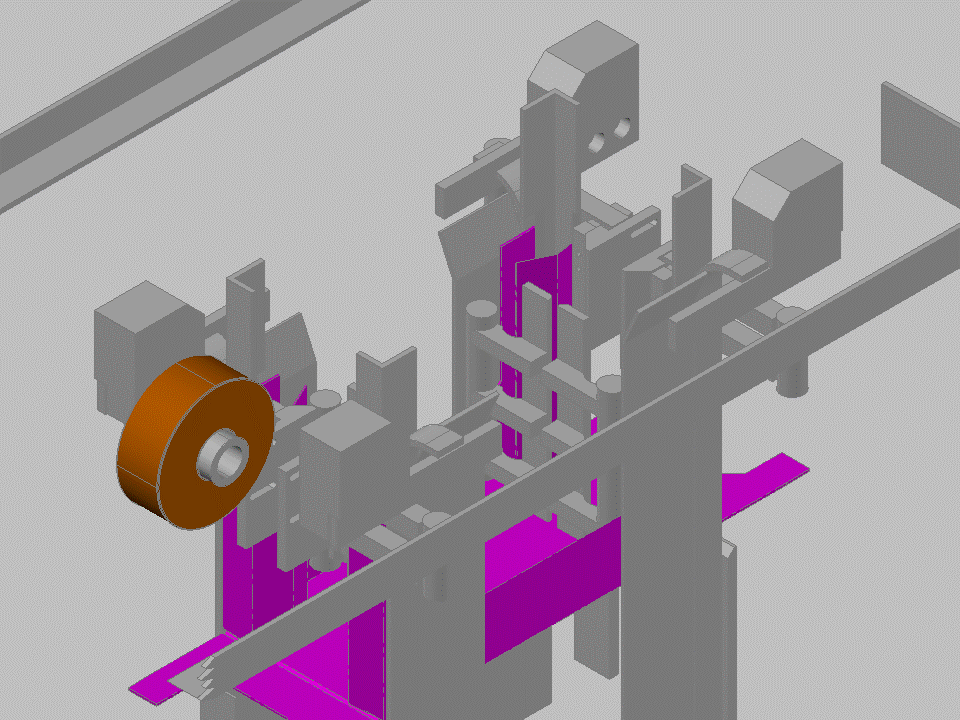
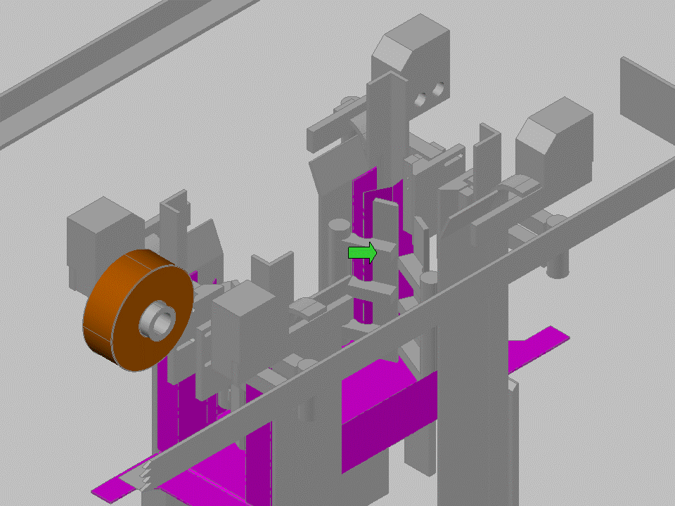
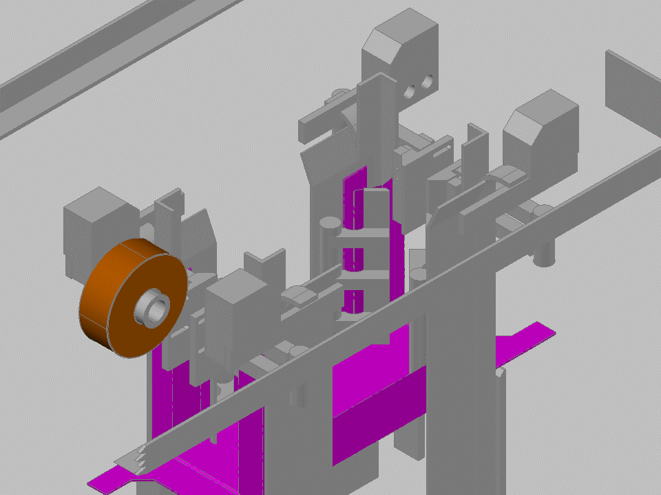
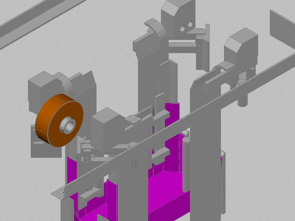
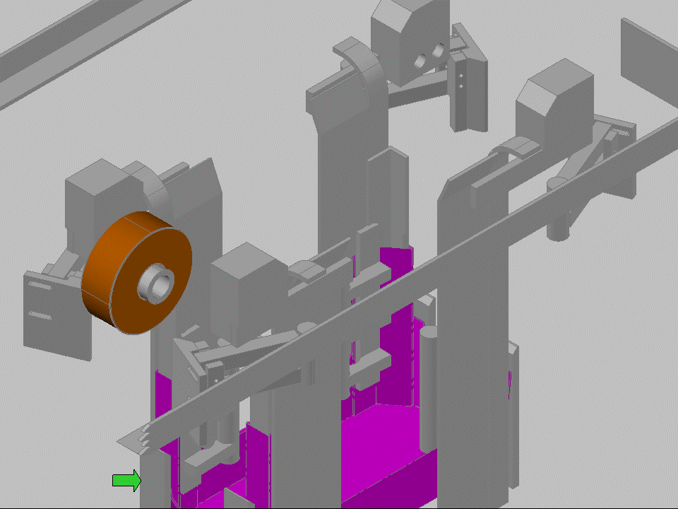
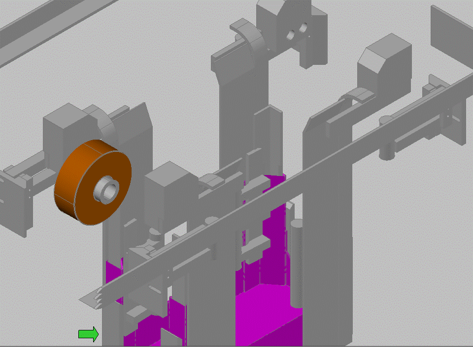
With an understanding of the machine cycle, I was able to define what the best settings were for the most robust folding in the machine. I was also able to take the various relationships and make a CADD model of the machines various motions. By doing this, I was able to identify a number of points of instability in the folding process that allowed us to make small modification and greatly improve the consistency of the machine. I made a Powerpoint Movie of the cycle to be able to explain what I learned to the operation, so they could keep the machine in optimal condition and know what happens when it varies.
Machine Cycle Charts may not be a solution for every problem, but I have found that they are a great starting point. The exercise of digging in to how a machine actually works is an investment that will pay dividends for years to come. The better you understand the theory behind how a machine runs, the easier it is to solve problems and make improvements. In other articles, I’ll expand on how I’ve moved forward using the Machine Cycle Chart as a foundation to build on.
So, next time you are asked to produce or review a Machine Cycle Chart, put the effort in that it deserves. This item is far more than just one of many on an improvement process checklist.









Pingback: Homepage